
How to arrange products inside a glass display cabinet

A glass display cabinet does not sell, protect or showcase anything by itself. What is inside does the work. Whether you are styling a retail counter, a home collectables display or a museum-style installation, how you arrange the pieces is what separates a cabinet that looks deliberate from one that looks crammed full.
This guide walks through the principles that make a glass display cabinet earn its place in the room — the same principles luxury retailers and museums apply to every window and vitrine they touch.
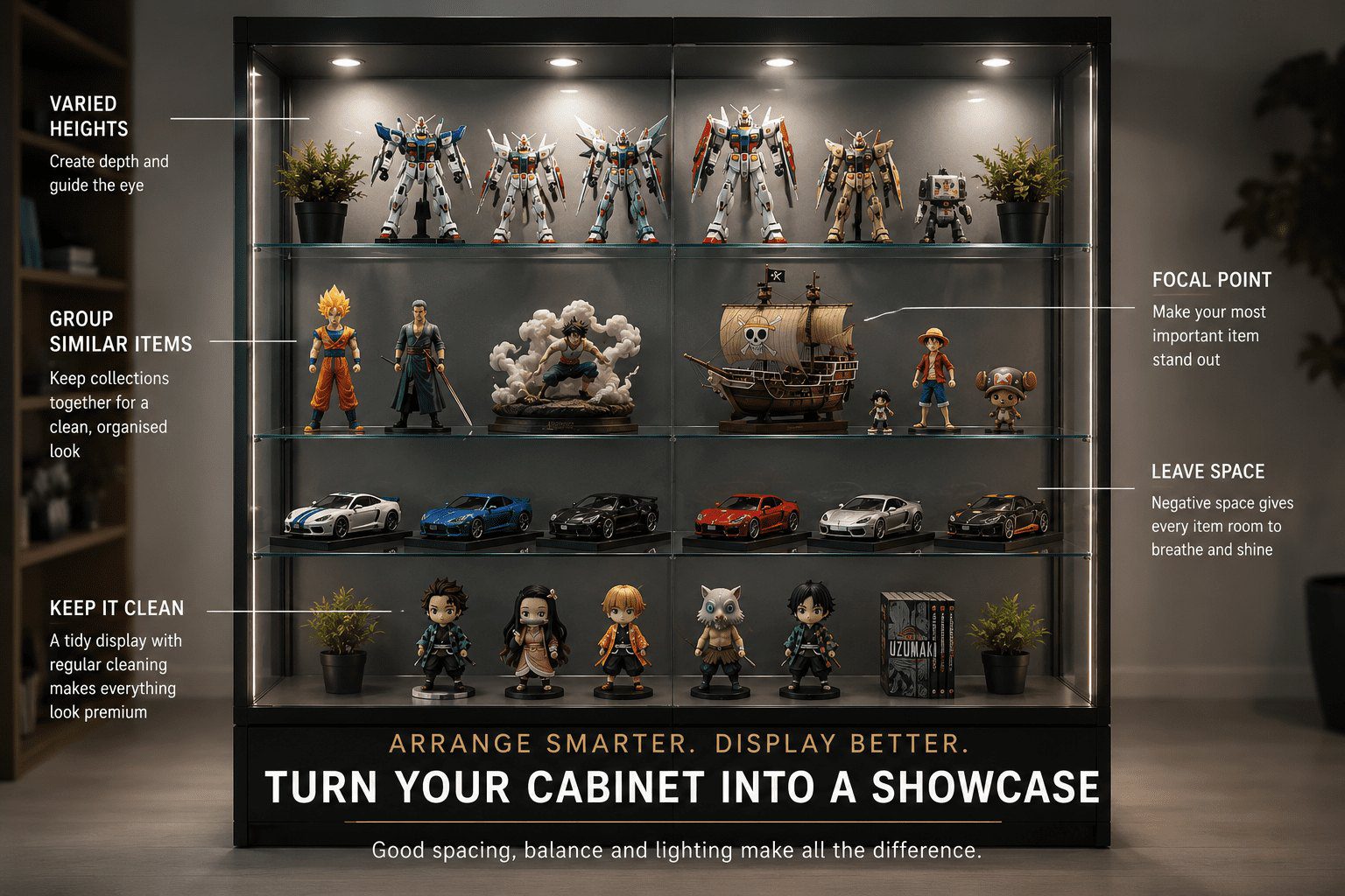
Start with a focal point
Every display needs an anchor — one piece, or one group of pieces, that the eye lands on first. Without a focal point, the cabinet reads as a wall of stuff and the viewer does not know where to look. Pick your best item, your most expensive item, or the piece you want to move, and build the rest of the arrangement around it.
A focal point usually sits at eye level — roughly two-thirds up the cabinet for a standing tower, or dead-centre for a counter unit. The space around the focal point matters as much as the piece itself, so give it breathing room. A hero piece surrounded by clutter stops being a hero piece.
Build in tiers, not flat layers
Flat shelves with everything lined up at the same height look static. Use risers, blocks, fabric mounds, or a mix of shorter and taller items to create varied levels within each shelf. Tiering does two things: it leads the eye through the display, and it lets shorter items stand out instead of getting lost behind taller ones.
For jewellery and small collectables, simple acrylic or fabric-covered risers in 30mm, 50mm and 80mm heights are enough to transform a flat shelf into a layered arrangement. Larger collectables like trophies or model vehicles benefit from staggered front-to-back placement instead.
Group like with like
The brain reads order faster than chaos. Group items by category, colour, era or material and the display becomes legible at a glance. Watches with watches. Rings with rings. Blue with blue. Bronze with bronze.
This does not mean rigid grids — you can still mix scale, height and angle within a group. But mixing categories at random, a watch next to a coin next to a teacup, forces the viewer to work, and most will not bother. They will glance and move on.
Mind the negative space
The mistake most arrangers make is filling every available centimetre. Glass cabinets work because they let light and air move around the pieces. Fill every shelf edge to edge and the cabinet stops feeling like a display and starts feeling like storage.
Aim for roughly 30 to 40 percent empty space across the visible surface area. It feels wasteful but it is exactly what gives premium displays their premium feel. Compare any luxury boutique window to a discount store and the difference is mostly empty space.
Work with the light
If your cabinet has LED downlights or top lighting, your arrangement should account for where the brightest pools of light land. Place hero pieces directly under the light. Avoid putting reflective or metallic items behind tall opaque objects that throw shadows across half the shelf.
For cabinets with corner COB strips lighting the interior evenly, this matters less — but you still want to angle reflective pieces to catch and bounce the light toward the viewer. A polished surface facing a dark wall throws away half its impact.
Principles vs common mistakes
| Principle | Do | Avoid |
|---|---|---|
| Focal point | One hero piece at eye level with space around it | Everything competing for attention |
| Shelf heights | Tiers, risers and varied levels within each shelf | A flat line of items at the same height |
| Grouping | By category, colour, era or material | Random mix that forces the viewer to work |
| Negative space | 30 to 40 percent empty across visible surfaces | Filling every shelf edge to edge |
| Lighting | Hero pieces directly under the brightest pool | Tall opaque items casting shadows on smaller pieces |
| Refresh cycle | Rotate the focal point on a schedule | The same arrangement, every day, for months |
Refresh on a schedule
A display people walk past every day stops being seen. For retail, swap the focal point every two to four weeks. For home displays, every season. Even small rearrangements — swapping rows, rotating items, changing the focal piece — wake the cabinet up and make the same collection feel new.
Take a photo of the cabinet before you start rearranging. It is the fastest way to spot whether the new version is genuinely better or just different, and it gives you a reference for what worked last time.
The principles, applied
None of this is complicated. A focal point, varied levels, grouped categories, generous negative space, lighting that hits the right pieces, and regular refreshes. Apply those six principles to any glass display cabinet and the contents start doing the work the cabinet was built to support.
One hero piece at eye level → the eye knows where to look first.
Vary heights with risers and tiers → the display reads as designed, not stacked.
Group by category, colour or material → legible at a glance.
Leave 30 to 40 percent empty space → the cabinet feels premium, not crammed.
Refresh on a schedule → the display keeps earning attention.
At Hobbs Displays, every cabinet we supply is built to showcase — tempered glass on all visible sides, LED lighting standard, and adjustable shelves on framed units so you can set the spacing your collection actually needs. The principles above turn that cabinet into a display that does its job.
We can help you pick the right size, shelving and lighting for what you are displaying.
Get in touch Back to guides